
You have 0 items in your cart
Menu Printing Advice
Designing a menu can be a complicated task for any restaurant, bar or hotel. There’s a lot that goes into menu design: menu options, course options, the layout of the menu, colours, messaging and pricing and the list goes on. In this post, we will go over a few tips to make printing your menus a breeze.
When you are considering designing a new menu, take the following into consideration:
• Are the fonts eye-catching, easy to read and up-to-date?
• If you are using photos on the menu, are they clear? Do they make your food look delicious?
• Is anything missing from your current menu? Deals? Offers? Specials?
Order professional menus
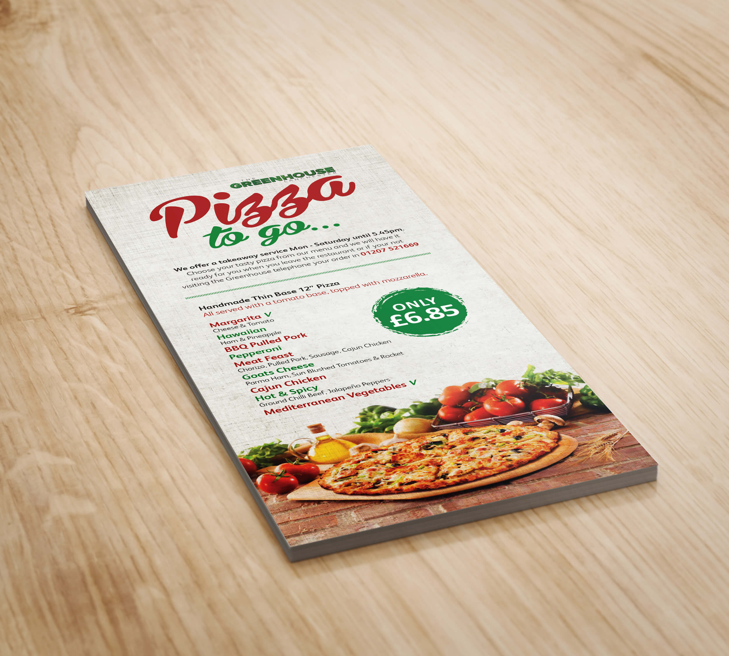
First and foremost, you need your menus to look professional in order for people to see you as a credible, professional restaurant owner. Would you want to eat a restaurant that can’t even care enough to get a good-looking menu? With professional digital printing, resolution and colours are vibrant, and the quality is a lot better to what home or office printers can do.
Don’t forget the “specials” sheet
Unique menu items like “fresh-caught,” “daily,” “seasonal,” “special” boost sales and keep customers coming back time and time again. To avoid having to constantly print and reprint your menus as your specials change, put them on a small insert inside of the menu that can be easily updated and reprinted.
Choose a simple paper
Choose a nice, sturdy white yardstick that prints well and that you can print any background colour on. Choosing this kind of paper will have your fonts, colours and images pop on the page and look a lot crisper.
Consider laminating your menu
Laminated menus will last a lot longer than paper menus and you can also clean them in between each use, something that’s more important than ever these days. We have a lot of different lamination options that you can choose from in order to ensure that you have the best options when it comes to choosing a menu.
Now that you have read over our tips to design and print menus that stand out from the crowd you should be able to choose a beautiful menu that is going to please your customers and have them coming back for seconds.
Think about your colour scheme
High-quality colour menus always make the food look more delicious and can take the food on your menu from blah to can’t resist! Here are the colours that we recommend for menus:
• Red, orange and yellow: These colours are warm and inviting while also being attention-grabbing and professional. Plus, did you know that red makes people feel more hungry?
• Greens, browns and earth tones: These tones convey healthy food and fresh ingredients.
• Black: Black will help you create a sleek and sophisticated vibe for your menu. Balance the black with red for a pop of colour and to give your menu that ‘wow effect.’


